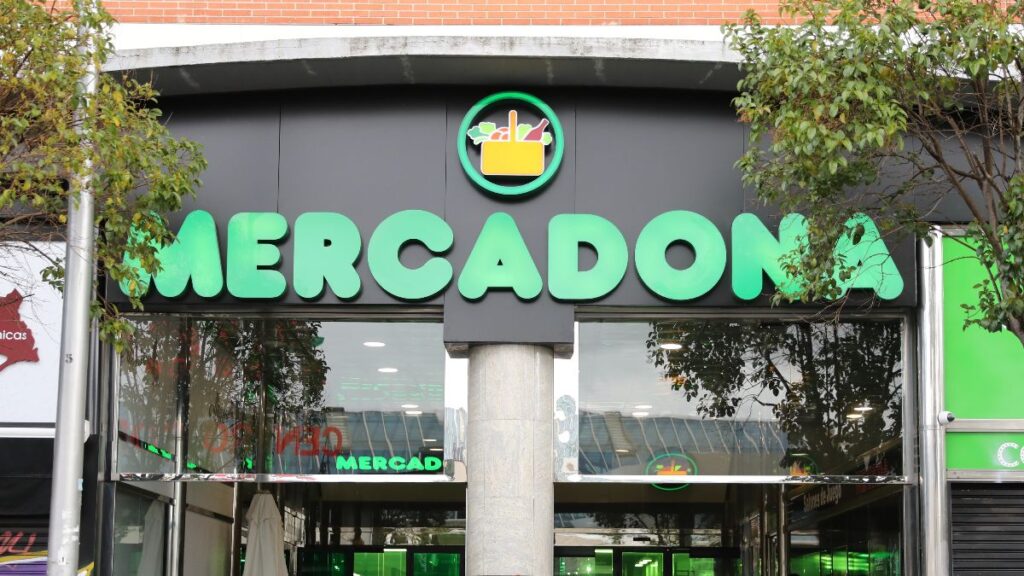
Mercadona is putting its efforts into updating its establishments to new demands and new types of customers, seeing how other chains such as Sqrups are expanding more and more with new sales strategies, so as not to be left behind in the competition between large food chains.
If a few months ago we saw how they launched its new supermarket format ‘Tienda 9’which sought to improve the internal work organization and give more relevance to sections such as fresh products, have now focused on improving their labeling. Thus, Mercadona has gotten to work and is introducing changes to the labels of its products with the simple objective that customers can find and better understand the information before deciding what to put in the basket.
Among the new features are larger print, reorganized content, more homogeneous nutritional tables and information per serving, as well as more visual preparation instructions.
The chain itself has explained these changes through your official portal. “When you choose a food, being able to easily find and understand the information on its label helps you make your own decisions,” they say from Mercadona, also ensuring that they had been working for some time to achieve “clearer, more legible and easier to consult” labeling.
To do so, the company claims to have listened to what its customers need when they have the product in their hands and what their main demands were, especially when choosing one product or another when they go through the aisles of the supermarket. The answer is easy, and it is none other than that the labels have “larger print, better organized information, standardized nutritional tables for all products, values per serving and more intuitive preparation methods.”
In short, small changes in packaging that seek to achieve one thing: that reading a label is not a complicated task.
Larger print and a simpler nutritional table
One of the changes that can most easily be seen is precisely in the size of the text.
“One of the most visible changes is in something as simple as it is important: being able to read the information well,” explains Mercadona. To achieve this, it has increased the font size and reorganized the contents, in addition to incorporating titles to visually differentiate the different sections.
The way of presenting the nutritional table has also been modified. And one of the complaints at the user level was that it was often difficult to understand this informative table on nutritional values, especially in some specific, more complex products. Now this is going to change, since according to the chain, they will seek to ensure that all products follow the same structure when presenting information, so that it is easier to locate a certain value and compare it with another food.
“We have worked to present the nutritional table in a more homogeneous way, making the different values easier to locate and compare,” he points out.
In addition to the usual values per 100 grams or 100 milliliters, Mercadona incorporates in some products an additional column with nutritional information per serving.
The company explains that this measure is applied “in products that add value,” so that the consumer can know “exactly what you are consuming.”
More icons to know how to prepare the products
The change is not only in the ingredients or calories. Mercadona is also modifying the instructions for preparing certain foods.
Oven, microwave or air fryer are already part of the daily life of many kitchens and the same product can accept different ways of preparation.
Hence, the company is making the preparation modes more visible, incorporating icons and images to quickly identify them and follow the instructions more easily. “The way we cook has also changed,” says Mercadona.
This entire process, as the chain itself explains, starts from observing how customers actually use the information that appears on the packaging. “We watch, listen and analyze how information is actually used and we translate that learning into the design of our packaging.” Afterwards, he adds, specific issues are checked, such as whether the font size continues to work correctly once printed on the final packaging.
Mercadona also takes the opportunity to remember some keys when reading any label. The ingredients appear ordered from greatest to least quantity, so the first is the one with the greatest presence in the recipe, while the allergens appear highlighted to facilitate their identification.
In the nutritional table, it is recommended to pay attention, among other elements, to fiber, proteins, sugars, saturated fats and salt. In the latter case, it indicates that from 1.25 grams of salt per 100 grams of product is considered a high content.
Mercadona will have to pay more than 500,000 euros for firing a worker who reported workplace harassment
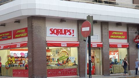
The ‘lowcost’ supermarket that is displacing Mercadona: it already has more than 140 stores in Spain
Of course, the company itself insists that it is not about just sticking with a figure. “The key is not to stay with a single piece of information, but to have information that helps you better understand what you choose.”